Tuesday, July 24, 2018

World Watercolor Month 2018 Week 3 (July 16-21)

Continuing World Watercolour Month from my Week 1 post and my Week 2 post.  This is a little blog showing my progress per piece and inspiration - basically a more expanded version of what I've been posting over on Instagram.  Yeah, this is late, I know.  I had a beach day on Saturday so I had no scanner for my work and really, no inclination to take a break from a wonderful day.  I'm keeping this up for mostly personal reasons anyway, so I figured it could wait..

In all cases, clicking the image of the finished painting will take you to the full-size posting on deviantart.

July 16: More Maine coastline
Another photo from my Maine beach day two days before this.  It was a view from the parking lot of a wildlife refuge.  The houses are not accessible by car or on foot except during low tide.  I found the view quaint and vibrant enough to draw it.  Because I've been having problems capturing New England skies - so moody and gloomy compared to the vibrant Arizona skies I'm used to - I followed Scratchmade Journal's tutorial on painting skies and clouds.  Fortunately released that day!  I finally nailed that New England sky.

The paper, if you're wondering, is Khadi Papers paperback sketchbook (not the hardcover you've probably seeing all over watercolour instagram).  Paints soak in right away and colours spread all over if applied when it's not bone dry, so it's wonderful for these loose, wild experimental sketches and for more dry brush work.  I love it, but it's certainly not for everyone.

July 17: Plein Air - Great Bay again
I woke up very early, so I went back to the Great Bay Wildlife Refuge and painted some trees I saw on the path.  I also saw some birds, very close to me!  A white-breasted nuthatch, which I've only seen in pictures, two woodpeckers that may have been either the downy woodpecker or the hairy woodpecker, and a warbler that was so bright blue and yellow in colour I think it may have been a northern parula.

July 18: My friend's cat
A couple weeks ago my friend sent me a picture of her cat that I found highly amusing.  It looked like her cat was plotting world domination, so I asked her if I could (eventually) paint the scene.  And I did.  This was my first time using the Khadi Papers rough sheets, which I believe is the same as the paper in their hardcover sketchbooks that I keep seeing people rave about on instagram.

July 19: Seashell from the beach day
During the beach day last Saturday, my boyfriend found a cool, oddly textured shell and gave it to me.  It's probably from a purse or hat rather than something that would normally be found in Maine, but it was still cool-looking and I painted it.  I went for a different, tighter style than I normally do and this was the result.  I was not quite happy with it, so...

July 20: Seashell Re-do

...I redid it!  Went with my usual style, and I like it much better.

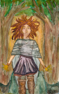
July 21: Goddess or Faerie
This, again, was loosely inspired by Eluveitie.  This time it was a combination of the songs "Rebirth", "Epona", and "A Rose for Epona".  This took a lot of glazing and patience, so I'm super proud of it.  I imagine she is is a fertility or nurturing goddess, coming out to a believer who called...whether or not they knew they called her, or were entirely sure of their belief. She may be the goddess of this place, this land, these people only, or she may showing a mere facet of herself in this form and place. I always envision some kind of goddess or otherworld spirit appearing like this when I hear the following lines from "Rebirth":
"In front of Antumnos' gate 
I beheld the mirror in the lake 
Recognize I did not 
Nor did I comprehend."

Of course, she could be aloof (as in the case of "A Rose for Epona"), and I imagine the person she is approaching right now may have that same skepticism of her.

So that's Week 3 of world watercolour month.  I'm still posting these day by day as I go on my Instagram profile, if you want to check that out!

Thursday, July 19, 2018

World Watercolor Month 2018 Week 2 (July 9-15)

Continuing World Watercolour Month from my Week 1 post.  This is a little blog showing my progress per piece and inspiration - basically a more expanded version of what I've been posting over on Instagram.  Yeah, this is late, I know.  I had a beach day on Saturday so I had no scanner for my work and really, no inclination to take a break from a wonderful day.  I'm keeping this up for mostly personal reasons anyway, so I figured it could wait..

In all cases, clicking the image of the finished painting will take you to the full-size posting on deviantart.

July 9: Spontaneous Painting
Spontaneous painting, after watching a lot of The Mind of Watercolor videos in which he talks about or discusses the approach.  I just dipped crumpled tissue paper in yellows and greens and blotted them on my little watercolour block, let them dry, and added some blue for shadows.  Once it began to take shape I retroactively found a reference by going through my phone until I found a picture of a clump of trees by my work parking lot that had similar-looking shadows and highlights, and went for that.  Not thrilled with it because I just could not get good shadows vs. highlights, which is probably partially due to the paper.  It's that Michael's watercolour paper that's incredibly cheap but workable, so it can't take more than three layers, maybe four if you use a light hand,  But hey.  Another learning experience!  And I learned not to touch the lake too much and let the paint do its thing.

July 10: Ravens in the Fading Light - "light and luminous"
Had some time before work, but no ideas for today's piece.  Looked at the prompt, saw "light & luminous" and immediately knew I wanted birds silhouetted against a daybreak or sunset.  Et voila.

I may even do this one later on cotton paper!

July 11: "beautiful blooms"
Experimenting with salt textures.  Did the wash of blue, yellow, and pink and overlaid salt on it.  Loved the result and went to look at old pictures I'd taken, found a lot of water and trees from Vancouver and Melaque, and frankensteined the best parts together.  I think I did well!

July 12:
Got some new Chinese brush styles, and decided to practice.  My scanner eats all yellows, so I promise this piece is not this hideous, and those things actually do look like bean stalks in real life.

July 13: 
This one was difficult.  I saw the prompt was "Fast and loose", and that is a painting style with results I've long admired.  I wanted to tackle it, but wasn't sure how.  I decided a dancer or shaman would be perfect.  Here, I was trying to do a perspective piece, viewing the girl from slightly above so her body receded from the viewer, but I would up failing and that's why her head and shoulders look so large and wide compared to the rest of her body.  But I did get the painting style, I think.  I actually did the sketch and inking the lineart with a brush on Wednesday the 11th so I would be ready to quickly crank this out tonight.

I think I at least nailed the painting part, and got a decent swamp background.  Neverending stoooooryyyyyy...

July 14: Plein air and beach day!
I went to Maine Saturday morning to meet up with my boyfriend and meet his mom and his brother.  We started the day with breakfast and sat in the outdoor seating area of a restaurant.  I loved the view, so of course I had to paint it.  I used painting methods I've seen Teoh Yi Chie use in his youtube videos, because I love the vibrant results he gets from mixing paints on the paper instead of the palette.  I absolutely love how it turned out!  I have other sketches from this day - 3 total, all plein air, all my first true and complete plein air (i.e., completely done in-field instead of sketched there and worked on later) - and I love the result of all of them!

July 15: Tiny Monsters - on the beach!
I saw a picture of a coconut palm with a mound of coconuts below it, and the arrangement of the coconuts looked like there could be critters hiding in it. But instead of imagining creepy crawlies, my mind envisioned cute little fuzzballs with glowing red eyes and demon horns. Something more huggable than scary. I overdid paint concentration in the background and overpowered the whole thing, but I do like the concept, so I hope to do this properly soon.


So that's week 2 of world watercolour month.  I'm still posting these day by day as I go on my Instagram profile, if you want to check that out!

Monday, July 09, 2018

World Watercolor Month 2018 Week 1 (July 2-8)

So I've been doing World Watercolour Month.  I found out about it on July 2, hence why July 1 is missing.  But this week I managed to do a piece a day, even hastily on July 2!  This is a little blog showing my progress per piece and inspiration - basically a more expanded version of what I've been posting over on Instagram.

In all cases, clicking the image of the finished painting will take you to the full-size posting on deviantart.

July 1: Sir Not Appearing in This Film
I did not know about World Watercolour Month on July 1.

July 2: White-Throated Kingfisher
So Day 2 (my first day), I decided to tackle a white-throated kingfisher, for many reasons:
  1. I found out about World Watercolour Month via a watercolour group I belong to on deviantart around 6pm, so I had to finish and scan a piece ASAP;
  2. I'm most comfortable drawing birds and desert landscapes;
  3. It seems like the common kingfisher (Alcedo atthis) is a super popular subjects among watercolourists, BUT...
  4. I've, uh...never draw or painted a kingfisher ;
  5. from the birders I follow there are so many kingfisher species, just as stunning as the common kingfisher, if not moreso; and
  6. kingfishers are fucking adorable.
White-throated kingfisher (Halcyon smyrnensis) and Google images of the lovely beast.

The kingfisher piece didn't take very long.  30 minutes, maybe?  That's also why I messed up and have a band at the neck that doesn't exist on any photo I've seen of the bird, as I was trying to rush to get the piece finished, scanned, and submitted online.

July 3: Golden Marmoset - primary colours
This day was, in my opinion, a massive success.  The suggested prompt was primary colours, so I picked three colours I don't really think of as "going together".  I didn't know what my subject matter would be - perhaps steak? - but that day a primate-loving friend texted me AND direct messaged me on instagram, begging me to paint gibbons!  What's funny about this is that since I went to the Antwerp Zoo on a trip to Belgium in June, I'd been wanting to paint a gibbon, especially after reading an article about a two millenia old Chinese crypt that held the bones of an extinct gibbon species.  But the only animals I've ever painted are birds, and the only drawings I've done of other animals are doodles of my dog and of cats.  I never like to dive out of my comfort zone, so I decided to draw a golden lion tamarin, aka golden marmoset (Leontopithecus rosalia) to test the waters.  With its beautiful fur and mane, I knew it would be the perfect way to see if I could draw non-human primates, and also test out that primary colour challenge.  From the pencil sketch and inked version I knew I was doing well, and wow.  I was very happy with the final piece.


Process of the Golden Lion Tamarin painting.  Full size of the final posted on my deviantart page.


July 4: Wise Crow - saving an old drawing
This was a pencil sketch I did months ago that I actually hated.  I love the lyrics of the Nightwish song "The Crow, the Owl, and the Dove" and wanted to draw something inspired by it, but I detested the sketch I did back in March.  It just...I could not make it look like a crow.  I drew other crows in my journals...but it seemed this paper was cursed.  I got home late that night, so I decided to take out the sketch and see if I could salvage it.  The inking was...okay.  The jewelry looked right, even if the crow didn't.

Originally, I had wanted the setup to look like a Yu-Gi-Oh! card. So I looked up the Superstition Mountains outside of my hometown and added those in.  And perfect!  I did  go in with watercolour pencils for detail and deeper shadows at the end, but wow.  I shocked myself, especially with the colouring on the crow.

"A crow flew to me, kept its distance. 
Such a proud creation. 
I saw its soul, envied its pride, 
but needed nothing it had." 
From "The Crow, the Owl, and the Dove" by Nightwish.

July 5: Meh
I'm including it, but this one was a failure. I wanted to represent an Asian paradise flycatcher in flight, as I found them to be phoenix-like birds. I challenged myself to do it with Chinese ink and a bamboo brush, using simple brush strokes. I didn't plan much, and I believe that was my mistake. I would have scrapped it right away, but because of World Watercolour Month I made myself finish it. I'm glad I did, because I will try this again, with proper planning.


July 6: Direct Watercolour Landscape
I lost the photo I used as reference.  I challenged myself again- just brush to paper, no initial sketch. This is a cheaper watercolour paper so it can't take many layers, so when the paper was done, I thought it still needed more. So I went over it with a fountain pen. I liked working on it and how it came out, and will try on better paper.

July 7: Great Bay Wildlife Refuge
Last Saturday I went birding and took a photo of a particularly striking view.  Even though the photo is an iphone snapshot and doesn't capture the magnificence of that view, it was still stunning.  I had to paint it.  Given how good my World Watercolour Month tries have been coming out (with the exception of Day 5), I decided to paint from the photo I had of last week's adventure.  I decided to do a primary colours challenge again, with a different set of primaries in my palette.  Came out fine!

July 8: Pink-browed Rosefinch
I wasn't sure what to do for today, so I looked at the prompts for inspiration.  Today's was "something flying" so, since I love painting birds and am now comfortable painting them, I hopped right back into my comfort zone with a pink-browed rosefinch (Carpodacus rodochroa).  I'd actually painted one of these in May, as a quick 10-minute sketch.  That one is shown here, just because.

And that wraps up week 1 of world watercolour month!  I'm posting these day by day and progress as I go on my Instagram profile, if you want to check that out!

Wednesday, July 04, 2018

Inspirations from Music - Eluveitie

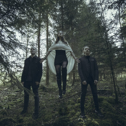
It's not even funny.  For whatever reason, I keep being really inspired in my art by the music of Eluveitie.  Even the band that three of the founding members formed has inspired me to do a piece of artwork so similar to their debut album promo images that I called it fanart:

This the Sound by NekoMarik on deviantART   https://www.cellardarling.com/photos.html
Left: My drawing.  Right: The promo images for Cellar Darling's This is the Sound album.

Quick process of that above piece.  It's not really that good, overall, but I'm super proud of it because it was my first full watercolour on actual watercolour paper in a long time, and I got to see all my improvement in one go:

Above: "This is the Sound" artwork process.
Below: One of the songs from Cellar Darlings This is the Sound album:

It was also my first full piece with my new, proper watercolours (Sennelier), and they were so vibrant and easy to work with.  The boots came out pretty good, and the poncho overlaying the dress did as well, particularly the transparent part! So I'm quite happy with it.  I would like to redo this someday in a less drawing-between-conference-breaks-in-my-hotel-room pressure, with figures representing Ivo and Merlin (the other Cellar Darling members) as well.  I love all the songs on that album, but I'm posting this particular one as indicative of my overall inspiration because it's the one that repeats the album title in the lyrics.

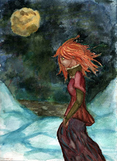
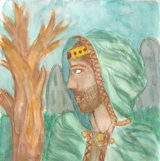
Well, that's the main one.  There's also a concept sketch and a watercolour doodle I did to practice folds in clothing and facial hair (horribly failed at the latter).  Both art pieces are inspired by album artwork, promo images, and overall feel of the album, but not really faithful presentations of the albums.  Thus I'm not calling them fanart.
Slanias Song by NekoMarik on deviantART  Druid I by NekoMarik on deviantART
Left: Inspiration from Eluveitie's album Slania (named for this song).  Right: Inspiration from their debut album. Example song. 

I also did a knit stitch based on a tutorial on how to encode words into knitted lace.  I didn't do anything fancy.  Rather than convert the word "Helvetios" into any number system, I just did a straightforward cipher and converted each letter in the word into its number in the alphabet, and did yarn overs according to the digits.  For zeroes, I just skipped a space whenever I had a 0 digit and began counting again- like 0 was a skip or a reset counter.  Because lazy.  That results in this loveliness:
 
I encoded the word "Helvetios" into this lace stitch, naming it after Eluveitie's album Helvetios, title song posted next to the stitch.  

Sloppily blocked, hence weird cropping on a phone snapshot, but I just wanted to visualize the stitch.  I did have to play around with decrease type and placement, but not as much as I thought I would have had to.  I still need to work out what I want to use the stitch in - thinking a bottom-up crop top.  I love how it came out!  Captures what I get out of this band's music.  Which is not for everyone, but hey...I love it, especially with all the added layers of old myth, spirituality, and history, in addition to great blends of folk and metal.

Saturday, March 24, 2018

Back to the Art Grind


Recently I've gotten back into art.  Since January 2017 I determined to draw or paint at least one thing a day.  One of my closest, and oldest, friends back in high school and college (I only graduated in 2015) would constantly tell me I was better at drawing than I gave myself credit for.  I never believed her, but last year I began thinking- well, does it matter?  I'm never going to improve if I don't practice.  So I've been practicing.  A lot.  Almost every day.
   
Left: The first attempt in a blank paper journal I bought earlier in the year.  Watercolour pencil.  Lines are poor, but the colouring is better than anything I ever did before that. 
Right: Sketch from a couple months later, same journal, same media.  It's not good, but you can see the massive improvement from the left-hand sketch. 
Note: Image links lead to a larger posting and description of the respective image.

Returning to art was shocking.  I hadn't worked on an actual art piece since high school, just doodles in my notes during college.  Turns out, sneakily doodling the people and objects around me kept me practiced, and my basic drawing skills had improved significantly since high school.  I hit a lazy point for a couple months, but then something shocking happened - Kelly, the friend who had encouraged me, died.  She and her mom were hit by a drunk driver.  Her mom died at the site, and Kelly passed two weeks later.  This past Saturday I turned 25, one year older than she will ever turn.  I threw myself back into an art frenzy and continued the writing frenzy I began that June, to honour her.  She never doubted me in anything, even when I doubted myself.  Hell, she's the one who replanted the idea of study abroad in my head!  So where this began as simple stress relief from grad school, it's now a form of therapy and a way to honour her memory.

 Summer Lady - watercolour practice by NekoMarik on deviantART A Taste of the Modern West by NekoMarik on deviantART
Left: A quick painting with cheap watercolours, June 2017.  
Right: Same cheap watercolours, January 2018.  I noticed they were opaque even on this different paper, and not super water-soluble.  I remembered that from doing the sketch on the right.  These convinved me to buy different watercolours.

I haven't stopped drawing and writing since, and this year I even went back to watercolour and bought real watercolour supplies, like sable and squirrel blend brushes to compare to each other, and have been using the high quality synthetic brushes my mom gave me from her days back in college for fashion design.  In January, someone from a journalling group on facebook even gave me some watercolour journals, which I've been using every day, sometimes more.  I've been homesick since last January, so there's a lot of desert and desert-influenced pieces, as well as my usual music-influenced pieces.

 Corset Study: Watercolour comparison by NekoMarik on deviantART

Above: Set A is the same as the woman and the canal, other cheap set B.  B is far more vibrant, translucent, and in general very watercolour-y.  This was the last of terrible paper, so I knew I needed a new, proper watercolour sketchbook. 

After many paintings with Watercolour Set B from set above including the one below with the girl in front of the palm trees, I decided I needed to properly learn watercolour.  So I went and bought an artbook from Jo-Ann's.  Took me a while to pick and finally picked out that, on flip through, looked the most informative and was actually trying to teach me watercolour (Beginning Watercolour by Maury Aaseng, if you're interested), some masking fluid, and went back home.  After a bit more research and the wonder of finding Parka Blogs, which gave me detailed information on watercolor sets for beginners, watercolour sketchbooks, and also had video reviews for multiple watercolour and other media (I'd also recognized him from fountain pen videos I'd watched before).  I work with pen and ink and do watercolour over the inked drawing, as does he, plus the way he writes and the way he films his YouTube videos works perfectly for me, and I've learned a lot.

When it came to paper,  I have a 9x12 inch Strathmore Visual Art Journal with 300 gsm watercolour paper I bought back in college and only had two paintings in, but I needed something a little smaller.  Someone from a journalling group I belong to on Facebook was super kind and, when I asked for their personal recommendations on budget-friendly watercolour sketchbooks, one of them offered to send me two. She actually sent me three! Two watercolour, one mixed media that is okay for a single watercolour wash but excellent for watercolour pencil.

Santa Barbara Girl by NekoMarik on deviantART
Right: Watercolour set B in a Stilman & Birn beta series sketchbook. I've learned much. I'm not good, but I've learned. The awkward light portions on the face, neck, and part of the shirt were scrubbed out after I learned about scrubbing out pigment, a couple weeks after I had actually painted this.


Now I saw that, if I was going to keep at this watercolour thing, I needed better watercolours.  I kept doing my research on watercolour brands, and eventually bought a Sennelier La Petite Aquarrelle tube set.  It's the student version of Sennelier, figuring that I did know I liked watercolour, but wasn't committed or had enough free time to warrant a full quality set in any brand.  They came in just in time for me to pour the tubes into an empty tin and half-pans right before I went to New Orleans for a business trip.  So, the first use for them was in my hotel room during a conference break.  I immediately saw the different between them and any of the under $6 watercolours I had ever used in my life.

 This is the Sound by NekoMarik on deviantART 
Left: The first painting I did with the new watercolours, between conference breaks in my New Orleans hotel room, in a Pentallic Aqua Journal I got from that awesome and very kind person!
Right: Similar intensity of pigment use in the same Stilman & Birn beta series sketchbook, from the same person, with the girl in front of the palm tree, with the Sennelier La Petite Aquarelle watercolours.  Excusing my lack of skill, the difference is amazing to my eyes.

So that's all for  now.  I haven't uploaded the last two images yet, but I will soon.  And I'll endeavour to post more often here, especially since I'm still knitting and crochet designing!


Wednesday, March 21, 2018

Rose Sorbet Tank (WEBS) + Bordeaux Cabled Hat (upcoming, self-published)

I haven't posted in a long time, so here's quickie.  At the end of 2015 I was getting ready to move from Arizona to New Hampshire, and for whatever reason in those last two weeks of December, when all my stuff was packed and all, I decided to submit a frenzy of knitting designs to publications that had posted in the Ravelry designers board, and one designs submission to an indie dyer.  The latter is how Infestation Cowl was designed to use just under a single skein of Knitting in France DK weight.  I also had a design accepted by WEBS, which was fantastic!  The design is Rose Sorbet Tank, which you can also view directly on WEBS.  Rose Sorbet was a challenge to write up- sizing, the sample, a bit of short rows, the whole lot.  It was my first go with tech editing and professionals looking at and examining my work.  It was amazing to see it go up and get published, but that giddiness was nothing compared to when I finally saw it in the WEBS paper catalog. Just- wow!  That felt good.
Then last year, I self-published design a lovely unisex hat with a bold cable.  Bordeaux Cabled Hat comes with instructions for both a slouchy version and a classic, non-slouchy beanie.  It comes in two sizes to fit 18-22 (22-26) in / 46-56 (56-66) cm head, which spans the average teenage to adult man and woman.   It is currently in testing, and will be out by the start of autumn, just in time to make before the bitterest of the autumn and winter start to chug along.


Bordeaux Cabled Hat can be worn with the cable at the center (Top 2 images of Figure 2) or off to the side (Bottom 2 images of Figure 2).  Pattern arrives mid-September.

And upcoming is something in a periodical I loved back in high school.  Yarn support came from the only yarn company I've ever bought from more than once, and I'm working on the sample now!